
Graphic Design
Michele Venisti Designer.
A sign that takes shape.
The logo and visual story of Michele Venisti Designer. A simple geometric symbol becomes the starting point for presenting the studio’s identity and the relationship between an idea, its form and the design process.
← All projects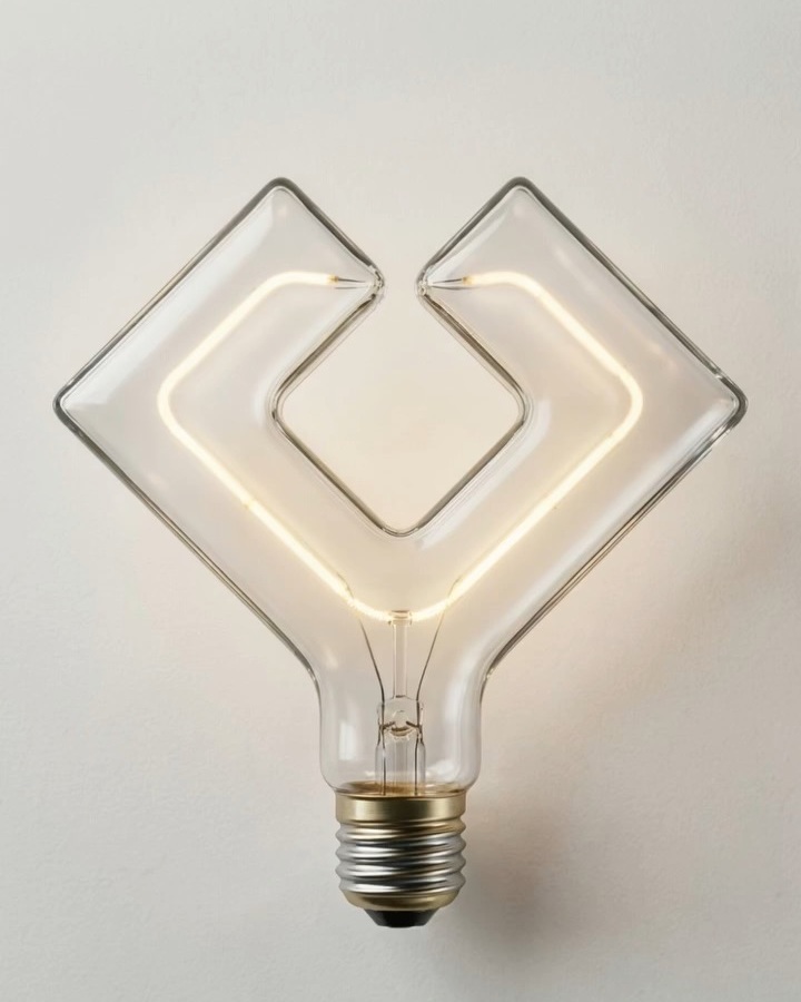
The project
From identity to a visual story.
The mark uses a few elements and a clear contrast between solid and open areas. An angular outline surrounds an open central space; symmetry makes the symbol recognisable even when it appears without the name.
The reel “My new logo. A sign that takes shape” tells this visual identity’s story. The symbol moves from graphics into a luminous image while retaining its outline: a transformation that evokes the transition from an idea to its tangible expression.

The design detail
Light as a metaphor for an idea.
In the video composition, a light bulb takes the shape of the mark. Its glowing filament follows the symbol and highlights its design. This is a visual interpretation used to communicate the identity, rather than the presentation of a manufactured lamp.
The white symbol on black preserves the original form without materials or effects. Together, the images show how the same mark can work both as a simple graphic element and as the starting point for a visual narrative.
Project video
The project in motion
Project information
- Design
- Michele Venisti
- Manufacturer / client
- Michele Venisti Designer
- Photography
- Original symbol and visual interpretation taken from the project reel.
More projects to explore.


Let’s work together