Graphic Design
Neurovita.
A mark to be recognised by.
Logo and visual identity designed by Michele Venisti for Neurovita. Within the brain symbol, moving arrows form the letter N, the brand’s initial. The symbol, name and wording neurofeedback dynamique come together in a contemporary, recognisable mark.
← All projects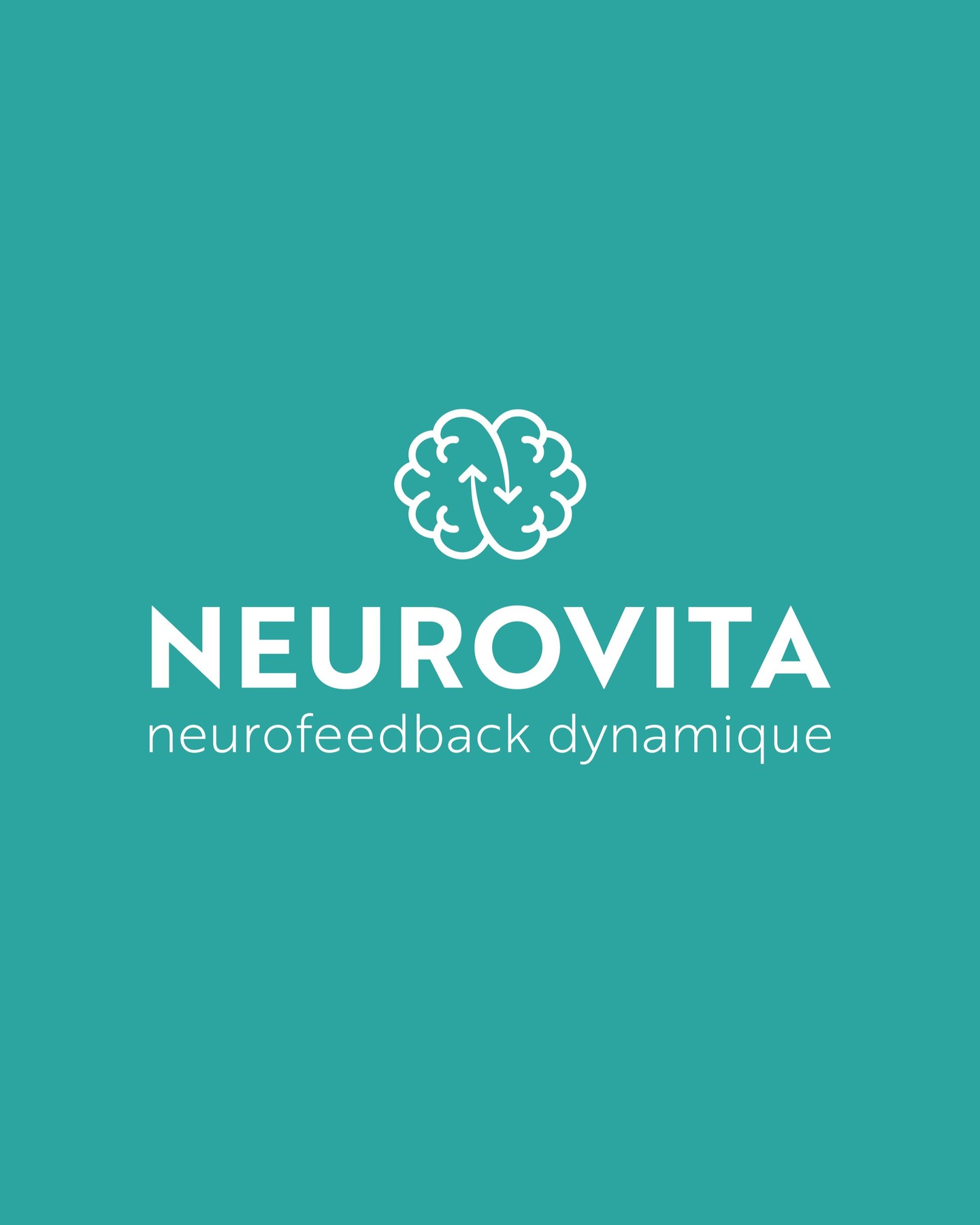
The project
Giving identity a clear shape.
The project begins with the need to make Neurovita recognisable through a simple mark. The symbol evokes the brain with a curved outline and contains the letter N, formed by moving arrows. The brand’s initial thus becomes part of the drawing, connecting the name with the reference to the brain.
Name, symbol and description work at different levels. NEUROVITA identifies the brand; the French wording neurofeedback dynamique clarifies its field. The composition keeps these elements distinct so that the mark can be read as a whole before its individual details.
The design detail
Symbol and name, together or apart.
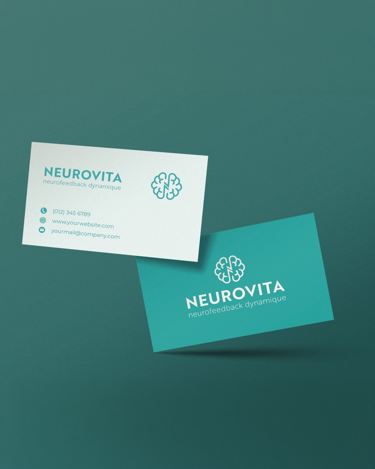
The uppercase lettering gives the name a stable presence, while the curved symbol introduces a softer element. The contrast between white and turquoise highlights both without adding unnecessary detail.
The business card applications show two expressions of the same identity: the full logo and the symbol on its own. White and turquoise backgrounds alternate filled and open areas while retaining a consistent visual relationship across the different formats.
Project information
- Design
- Michele Venisti
- Manufacturer / client
- Neurovita
More projects to explore.
Let’s work together